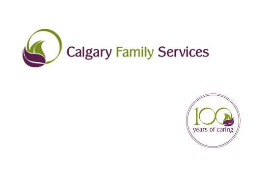
Calgary Family
Services
logo design
The logo design incorporates significant symbolism.
The leaf within a circle represent a person supported by a family. Both the leaves and the circle signify growth, health, sustainable life. The combination of two leaves demonstrate collaboration and interaction.
The colour green is: healthy, refreshing, and soothing, plus a symbol of growth, healing, freedom, and global consciousness.
The colour purple is inclusive of differentiation and a colour of teaching. It symbolizes heightened awareness, self-esteem, high ideals, gratitude and peacefulness.


